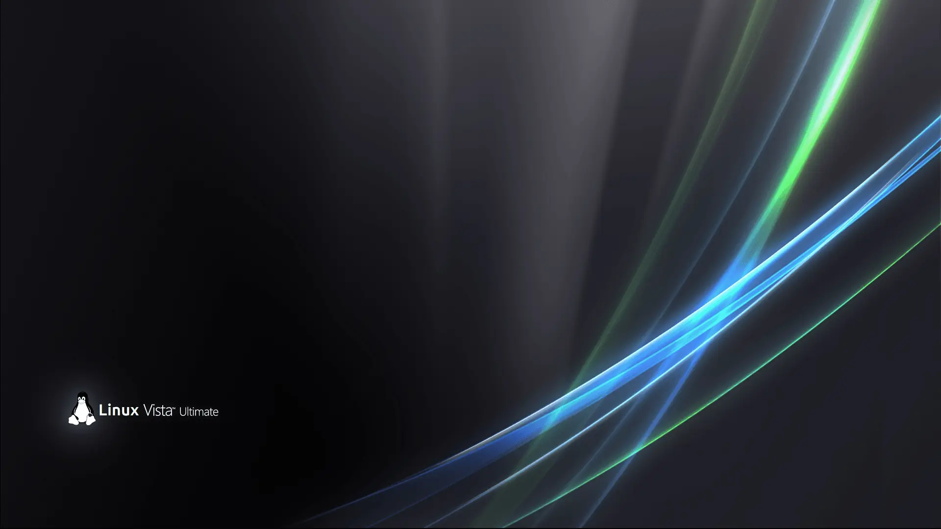
Not gonna lie, I loved the vista design language. It was just using way too many resources for the devices of that time.
I, too, miss when everything looked like frosted glass. I used to mess around with putting things behind the gaussian blur when I was bored.
KDE Plasma 5.27 running on Kubuntu 23.04 on my very low end laptop (I use Ubuntu btw). WM: Kwin Window decoration: https://github.com/paulmcauley/klassy (Klassy) Plasma theme & app. theme: Oxygen Icons: Vulpinity
Its beautiful. How did you get that scissor icon (guess its a screenshot tool?) and whatsapp in your systray?
It’s the clipboard icon from the Oxygen Plasma theme (all of the icons in the tray are)
https://i.imgur.com/AdP6fvK.png
On my KDE Desktop (OpenSuse) the Clipboard icon looks like this. The WhatsApp Icon opens a Browser with Whatsapp?Your clipboard icon looks like that because you are using the default plasma theme. Also, the Whatsapp icon opens an app which is actually just a browser
I am triggered. So good job I guess.
I know it’s just “disk” in Spanish, but still: 🕺🪩🕺
It’s Italian actually
Or Portuguese
With the info on your screenshot it could be several romance languages. I just chose Spanish because that’s my second mother tongue and because it’s the option with the most speakers worldwide (therefore highest chance of guessing correctly).
It’s an abomination, but I like that you are free to make it!
Could youprovide a link for the background image, please?


