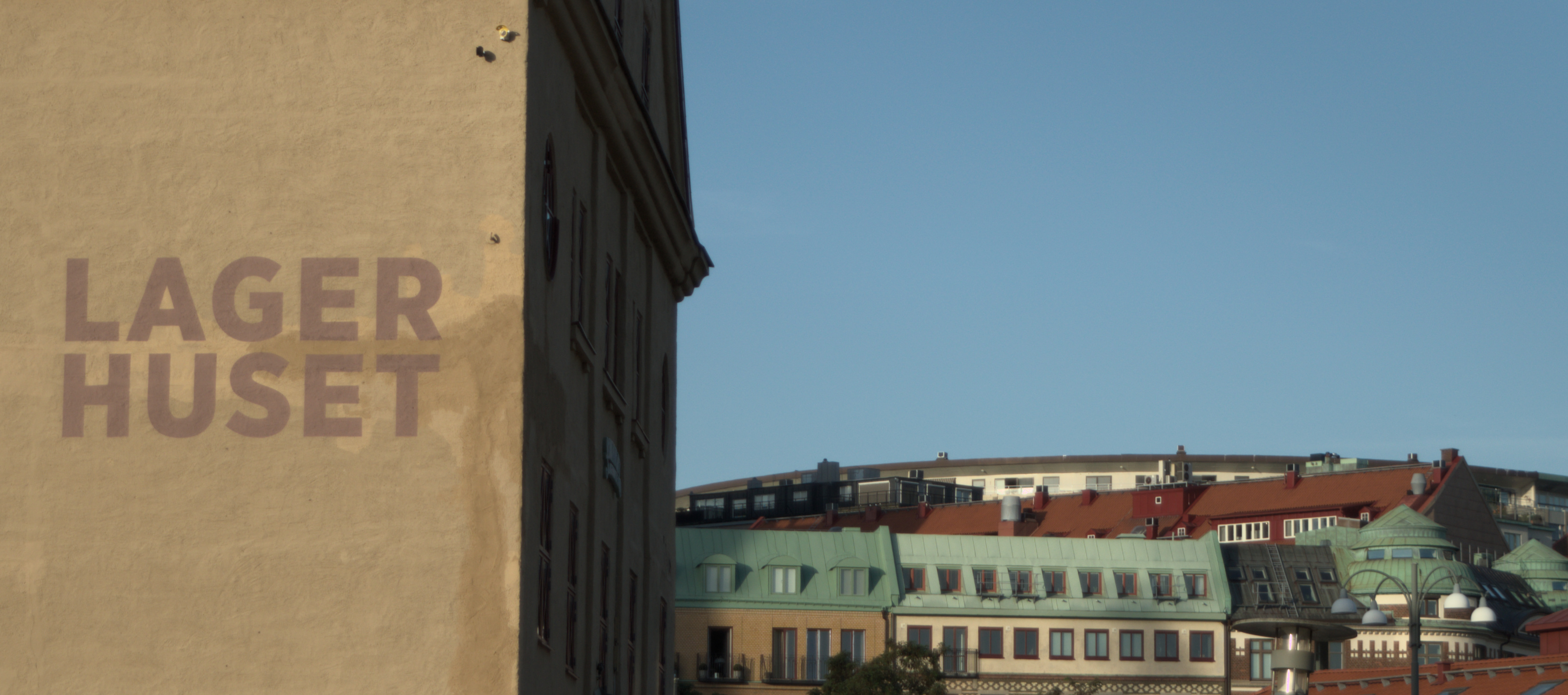
Looking back, I wish I had taken some steps to the left so that I wouldn’t have gotten the shady side of the house and also making the corner of the house straight relative to the framing. Right now I have rotated the framing in order to level the text properly.
Any other advice is welcome!


Here is an alternative crop: