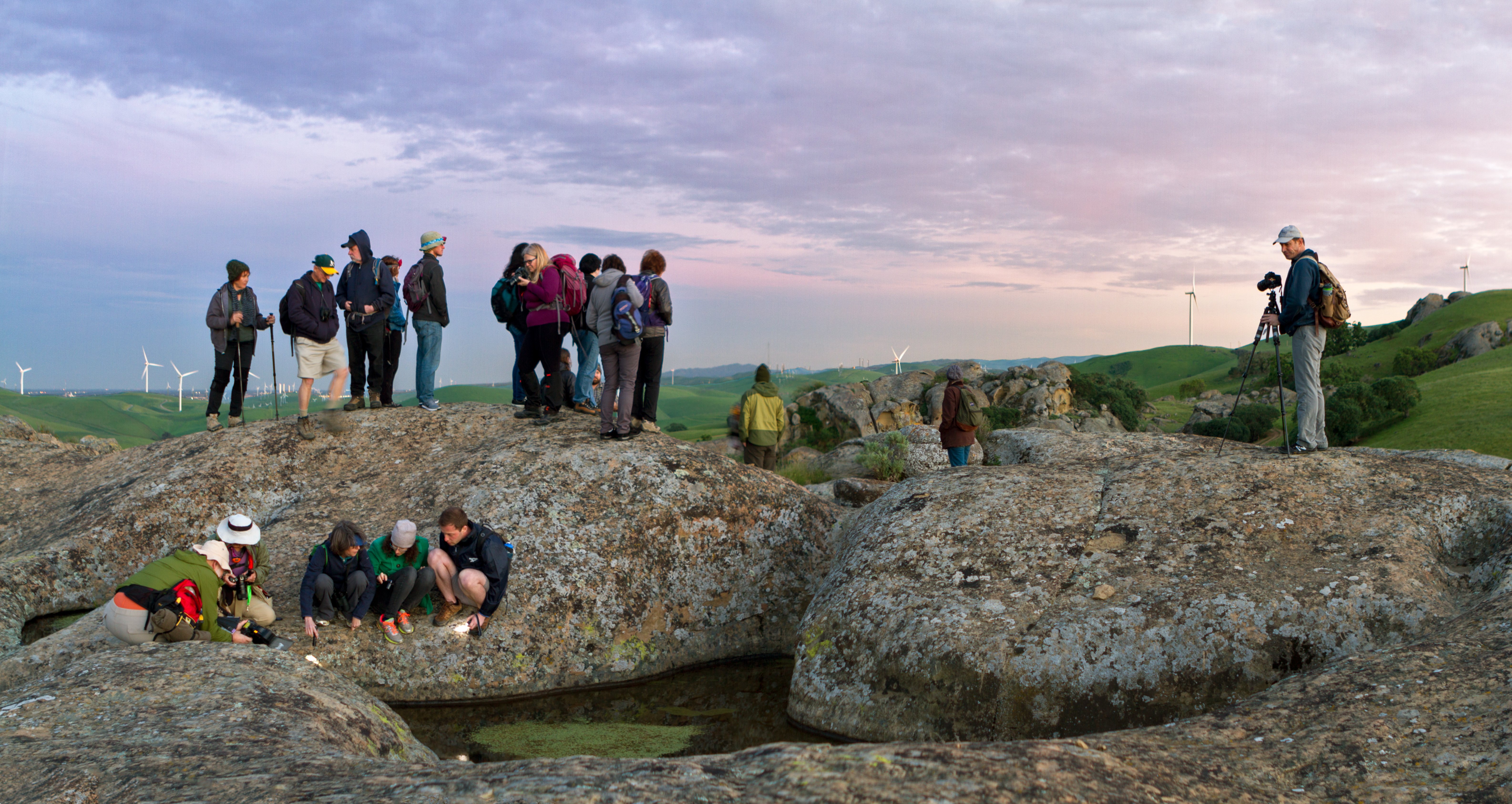
Hey all, I’m a hobby photographer, took this one a couple days ago and can’t seem to structure my own opinion about this snap.
I’m trying to convey the feeling of experiencing a sunset, but I don’t think sunset is very well expressed in this picture. I tried to boost the colors a little bit to help, would love some feedback on best practice for that.
Also not sure if I’ve chosen the best crop, but that’s somewhat secondary for me. Any and all feedback is welcome, I’m new to this whole Lemmy thing, here’s hoping it goes well!
If you’re going for people experiencing a sunset looks like you nailed it. Love the deep colors. Not a big sunset at the beach and cocktail in your hand type of feeling, but it’s a sunset scene and it’s almost over and nearly time to leave and you can see these folks soaking up every last bit. Great vibe here. The people make an arch to compliment the architecture. I like how the people are looking in all different directions. It opens the picture up. Well done.
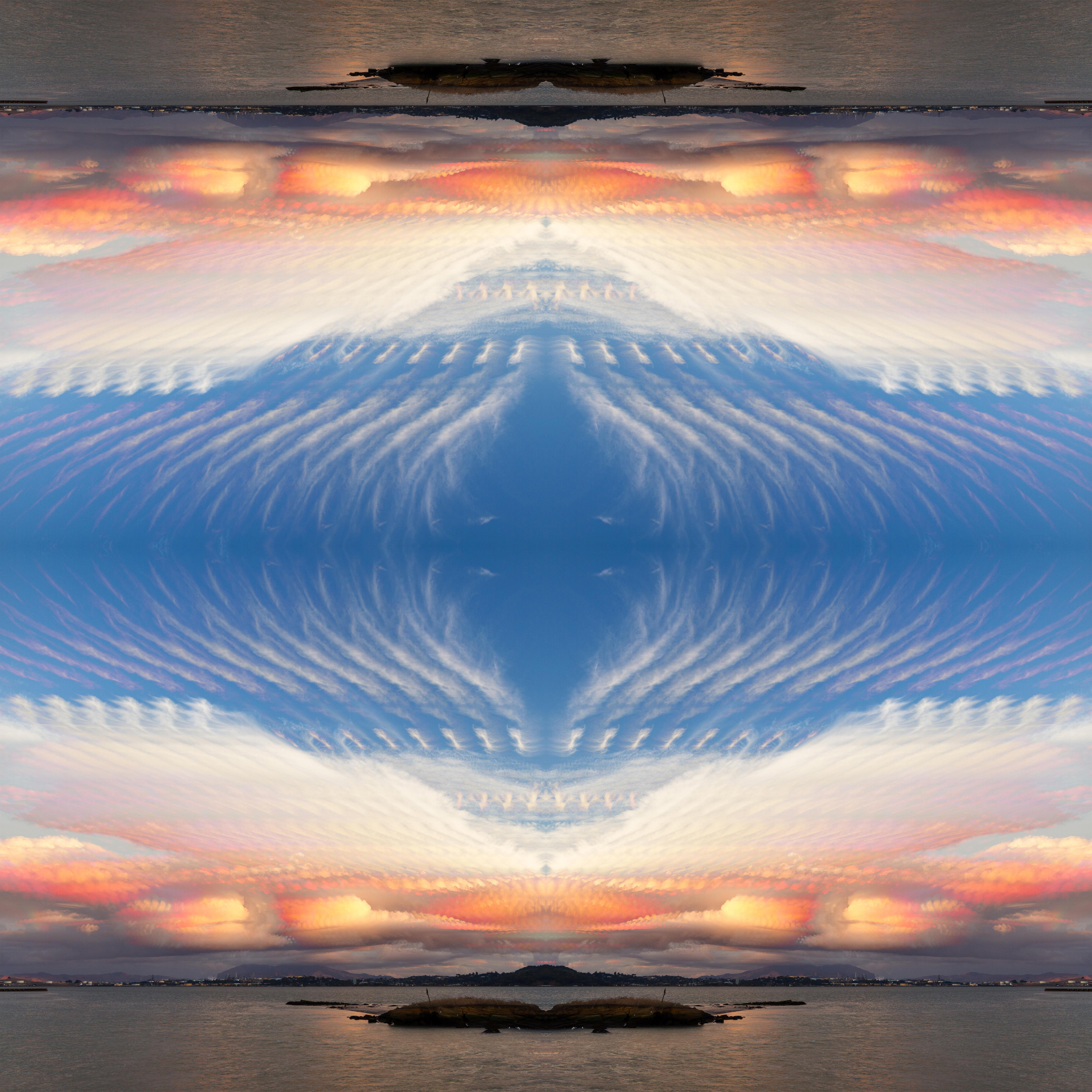
Here’s one of my photos you’ve reminded me of. Originally I wished for a bit “stronger” sunset here, but now I’ve come to like the peaceful soft colors.

Appreciate the feedback :)
I really enjoy that picture, the soft colors make it very easy for my eye to travel around the photo.
It’s not a bad shot at all. Colors are nice, composition is interesting. It might be a touch underexposed, but if you’re trying to sell dusk then that may not be a bad thing. The only time of day the sky looks like that is going to be sunset or sunrise, so I think your colors are mostly OK. A little bit on the cool side maybe, but that’s probably fine.
Now, is it the feeling of a sunset? No, not really. There’s nothing in the picture that conveys that feeling. You do have some interesting things going on – humans dwarfed by massive architecture, antiquity contrasted with people on their cellphones, a couple of interesting little vignettes in each cluster of people – but none of this says “sunset” to me. I think the image would be almost as effective if it was broad daylight, albeit a broad daylight with soft diffuse lighting. In other words, if you took “sunset” out of the image you wouldn’t lose much, except for the very pleasant background gradient.
But even if you didn’t hit what you were aiming at, I think that this is overall a fairly successful image. If I took it, I would be very happy with it.
Thanks for the critique, I really appreciate it! I’m still happy with this picture, but I think I’ll have to realign how I view it, as I definitely dont feel like I achieved what I set out to do when I snapped it.


